Pancea
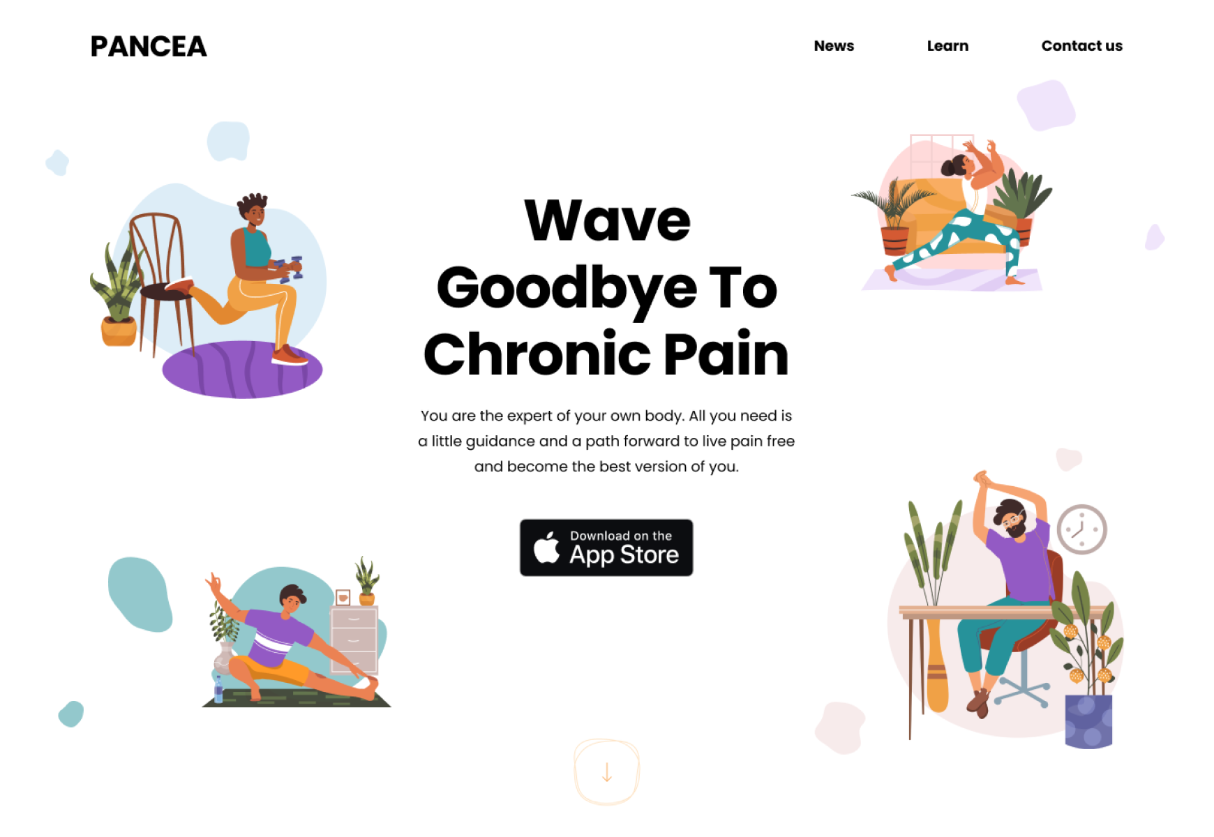
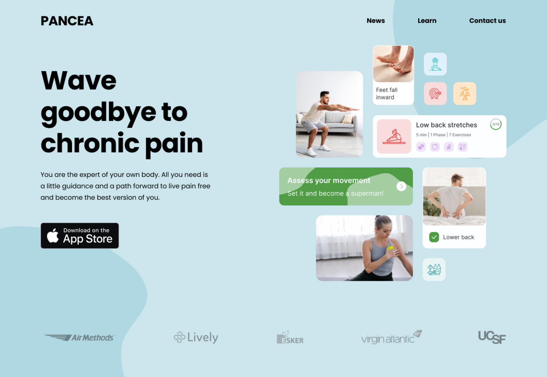
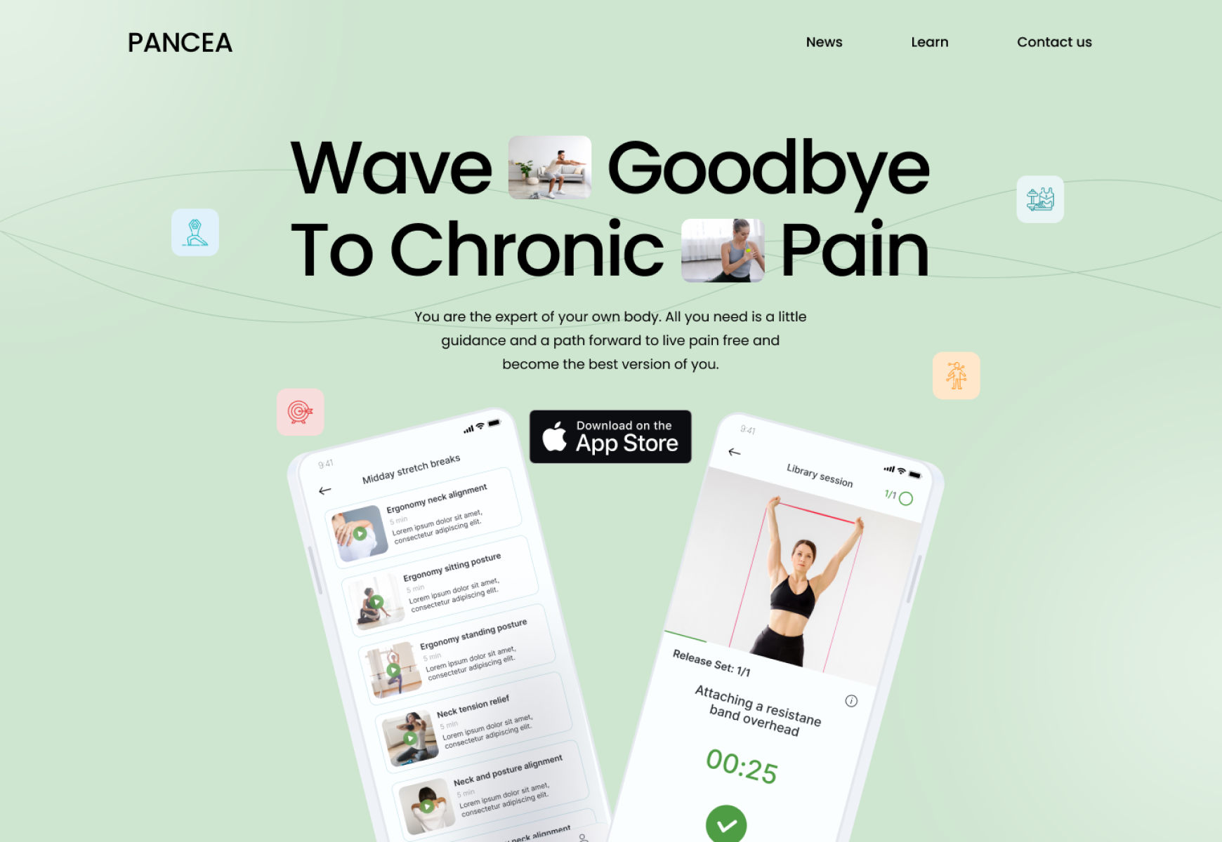
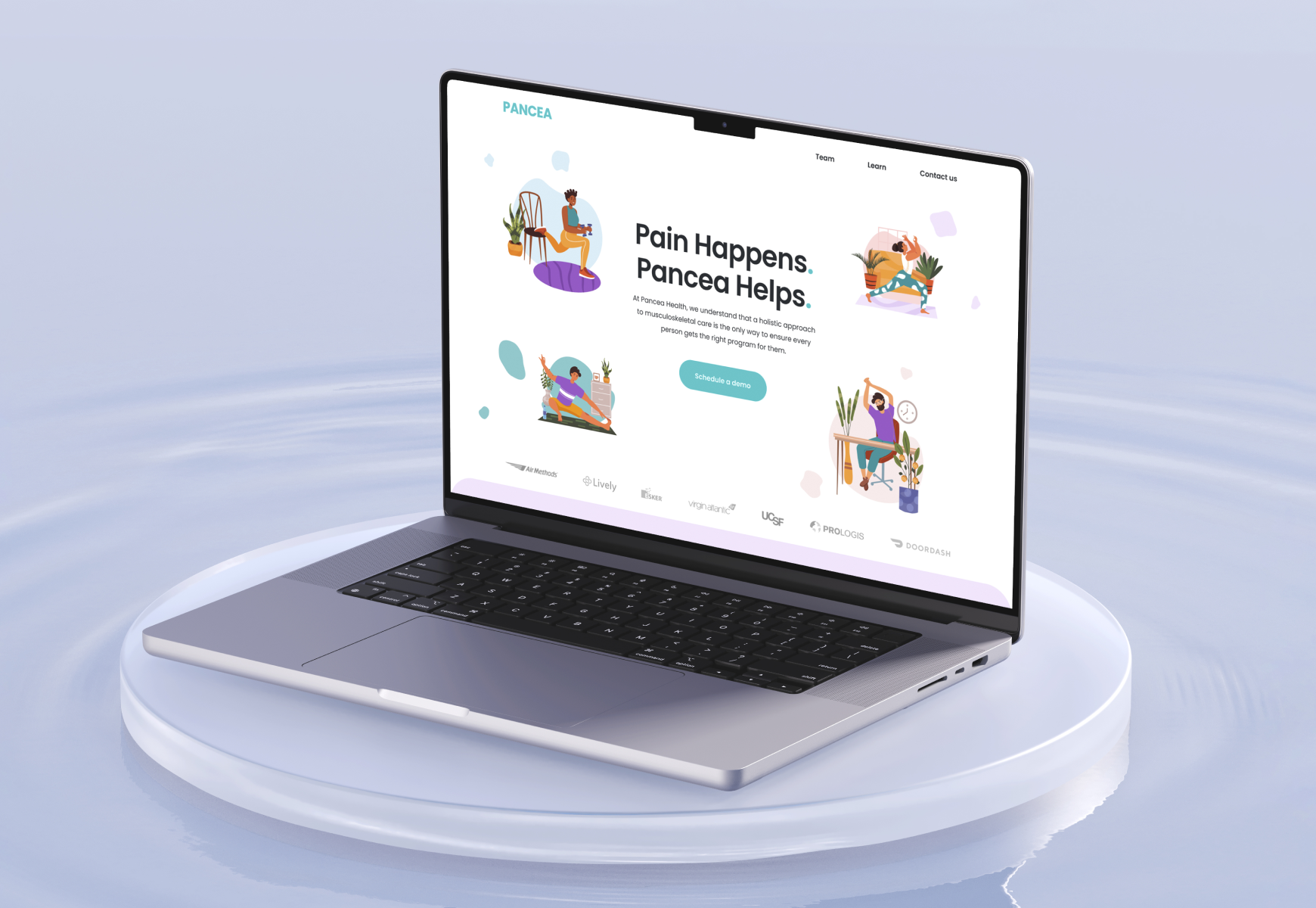
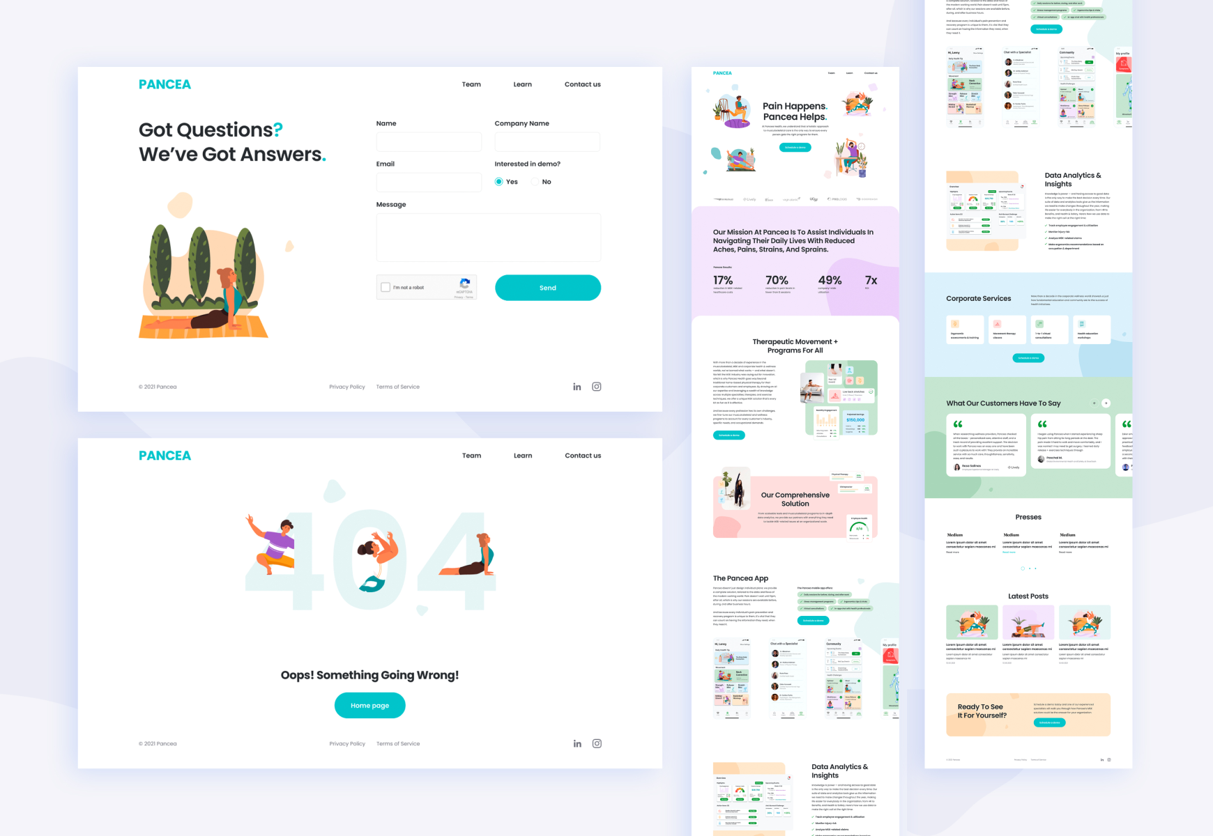
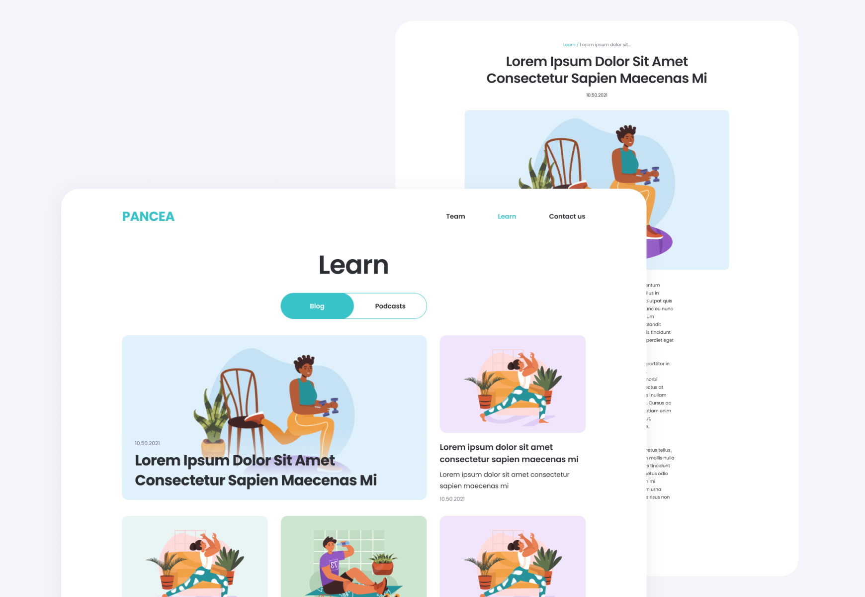
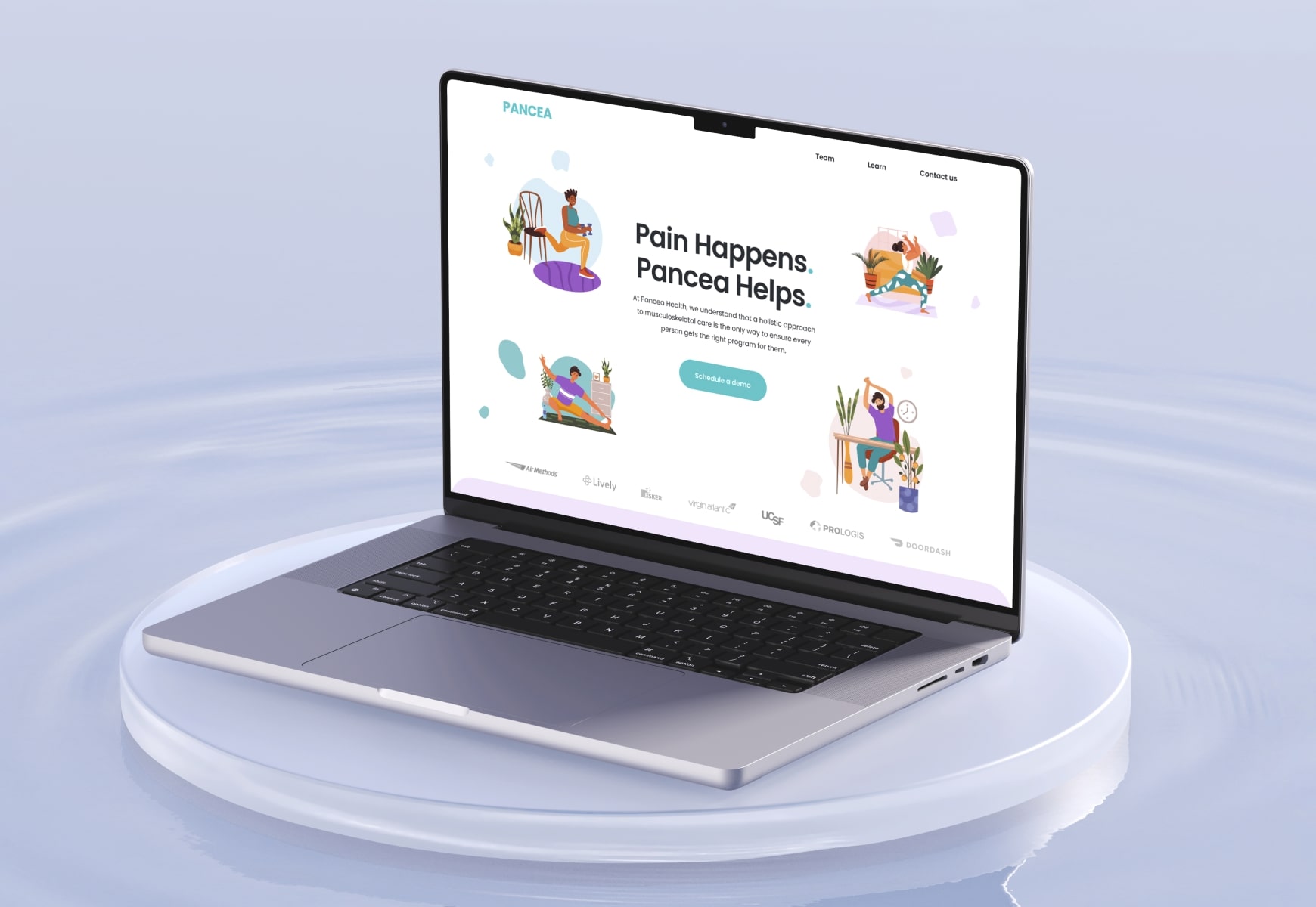
Pancea is a landing page designed for a healthcare app specializing in musculoskeletal care. Utilizing light pastel colors and minimalistic illustrations, the design focuses on clarity and user-friendly navigation.
- Design
- Development
- SEO
Pancea is a landing page designed for a healthcare app specializing in musculoskeletal care. Utilizing light pastel colors and minimalistic illustrations, the design focuses on clarity and user-friendly navigation.
- Design
- Development
- SEO
Many landings for healthcare apps overwhelm users with cluttered interfaces and excessive information, making it difficult to find relevant care solutions.
Pancea’s design addresses this issue with its use of light pastel colors and spacious layout, ensuring that users can easily navigate and find the personalized care programs they need.
Concept
Pancea’s design emphasizes a holistic approach to healthcare by using a calming color palette and minimalistic visuals that enhance user experience.
The clear space and intuitive layout guide users smoothly through the app, reflecting the brand’s commitment to personalized care.
This approach not only improves user engagement but also aligns with Pancea’s mission to provide tailored musculoskeletal care.
The Pancea landing page utilizes a harmonious palette of pastel colors to create a serene and inviting user experience.
Pastel purple, orange, green, red, blue, and turquoise are used strategically to highlight key elements and guide users through the interface while maintaining a balanced and visually appealing design.
The white background provides a clean, uncluttered canvas that enhances readability and allows the pastel hues to stand out. Dark blue text is employed for its contrast and readability, ensuring that information is clear and easily accessible against the lighter background.
Showcase
Tech Stack
- HTML
- CSS
- JS
- Wordpress
Our Services
- Research
- UX/UI Design
- Development
Anna O.
"Many thanks to Timur and his team for their work! We are delighted!"
